The Royal Veterinary College has made excellent use of colour in this leaflet, as well as typography.
Blue is the predominant colour used throughout, which helps give a sense of branding to the leaflet, and also helps to tie the entire design together. However, there are other colours used throughout, which are generally used for important eye-catching points (e.g. quotes, as shown in the example above).
All headings/subheadings feature large, uppercase typography, with paragraph text being written in much smaller regular type. This gives a great sense of hierarchy within the design.
#8 – 2010 Epic Awards
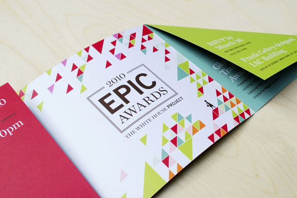
Designed for the 2010 Epic Awards Ceremony, this leaflet is perhaps one of the most beautifully designed leaflets of all time.
It makes stunning use of colour, although you’ll notice if you look closely that throughout, only a handful of colours are used. What’s more, red, green and blue are used in abundance, whereas other colours are simply used to break up the design.
Typography-wise, this leaflet is as good as it gets. It makes use of two typefaces; both of which pair together beautifully.
#9 – WWF Climate Change
WWF’s climate change leaflet (pictured above) had one purpose: to capture the attention of the audience and raise awareness of the issue at hand.
The designer opted for the use of large, bold typography to do this; which allowed the recipient to quickly glance at key issues, and it also gave a sense of the importance of those issues.
Clearly, the leaflet is predominantly black and white (i.e. black text on a white background), but the designer has also used a bright orange colour to accentuate important facts, figures and points.
It’s a beautifully designed leaflet that discuses important points with poise and elegance.
#10 – CHP
This leaflet was created on behalf of the Duke’s Centre for Healthy Policy (CHP), and it tackles important health-related issues.
Being serious in nature, it would have been quite easy for the designer to opt for a boring, bland design with a somewhat corporate feel to it, but clearly, the designer didn’t go for this.
Instead, we’re presented with a bright, eye-catching leaflet that manages to convey a sense of trust and seriousness, while also achieving a somewhat informational style.
The red and blue colour combination works beautifully well.


