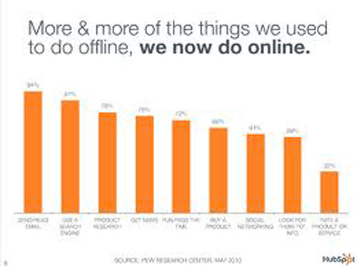
Okay, so we’ve gotten down to telling everyone about how inbound marketing in now the new face marketing on the Perfect Website Designing. Although we dare do not say that outbound marketing needs to be completely forgotten per SEO, what we’ve consistently preached though is that the bulk of a marketer’s time should be invested the inbound way instead.
Having said down, we believe that we’ve already stressed that part long enough and we now should be moving towards the next step. Let’s get to the nitty gritty part of how inbound marketing on Perfect Website Designing that can deliver those clients, prospects, leads, b2b partners or whatever it is you seek to attract on the internet – website design.
Here is a list of the most useful and practical way of Perfect Website Designing – making sure your website designs stays true to what online visitors wants:
Drop the Grid Style
Yes, we know that back in school this is the way we’ve been thought by our instructors on how to design a website. This technique was introduced to our young minds with a mission to keep the aspect, proportion and ratio of the parts of the website we’re making in check. It does a satisfactory job at that but someone has got to break it to you sooner or later. The marketing industry has already moved to a different direction and is now focused on using blocks. Different elements on a web page are now treated as blocks, each with its size and weight which makes it easier to balance the contents of a web page and highlight specific portions.
Add Spice with Images and Graphics
I’m sure you’ve seen sites which will greet you with text, entertain you with text and will direct you through its other parts with – (what else?), but – text. Relying heavily with your fonts will only detract visitors no matter how informative they may be. A touch of interesting and compelling graphics breaks the monotony of a page making it more bearable and may even be enjoyable to the reader.
Avoid Flashy ads
Advertisers have already given us website owners some freedom as far as how we’re to incorporate they’re ads in our sites. It’s like they’ve handed us freewill with all the options a brand gives on how their ad will be out up on a site. It is now our job to exercise that freewill and choose a banner that will look compelling, not be intrusive and would fit the overall theme of the site. And stay away from those hideous ads of the flashy kind. It does nothing to your site but lower its value.
Customize Your Social Media Icons
Almost every day we can see websites that are guilty with these. Social media integration is the wave of the future and yet there are still web designers who use the default social media icons on their site. Please take notice in the fact that they are not only boring but they are not meant to fit the overall look of your site. At least invest in how these icons would look because they are so valuable in websites nowadays. A competent web designer makes sure of that.
If you like this post, share it with your friends through email and social networks. Please don’t forget to  subscribe to our RSS-feed,
  follow us on Twitter and like our
 ![]() facebook Fan page for recent updates.
facebook Fan page for recent updates.


Naaz thanks for the good inbound marketing tips.
The post is absolutely fantastic! Lots of great information and inspiration both of which we all need! Also like to admire the time and effort you put into your blog and detailed information you offer! I will bookmark your blog!
thanks for the good inbound marketing tips.