Despite the fact that a lot of marketing has moved into the online world over the last decade-or-so, leaflets still remain one of the best ways to get the word about your product/service.
Leaflets are direct, informative and can be mass-produced relatively inexpensively (by printing companies such as www.solopress.com or www.fastprint.co.uk), making them perfect for large and small businesses alike.
However, in order for a leaflet to be an effective marketing medium, you need to pay attention to the design side of things, and that doesn’t just mean hiring a fancy graphic designer either.
It means knowing what makes a good, effective design, and what elements of a leaflet are likely to bring in results, rather than just looking pretty.
Below, I’ve rounded up some of the best, most gorgeous leaflet designs I’ve come across on the Internet to give you some inspiration.
#1 – Pact
Pact is a large capacity development corporation currently operating in more than 26 countries, and their leaflet design here is certainly one to be admired.
You’ll notice that the leaflet utilises a bold colour scheme (purple, predominantly) along with large bold typography and eye-catching imagery.
The genius of this leaflet design is just how clear and concise it is. Inside, it features the headline “building local promise.” which is then clearly explained in a short, to-the-point paragraph on the next fold.
It comes across as bold and energetic, yet also trustworthy and concise.
#2 – Wildlife Brigade
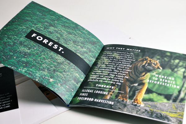
The Wildlife Brigade is all about “conserving places”, and this leaflet uses beautiful imagery to convey exactly the sort of places the organisation is referring to.
On the first page, you see a beautiful image of a forest with the bold headline “forest”. On the following page, the leaflet tells you why preserving the forest matters, and again uses bold and emotional imagery to help get the point across.
The intelligent part of this leaflet is not only the great use of imagery, however, but also the way in which it is set out.
It follows a logical format and everything is clearly divided and explained. Important points are given prominence via the use of bold typography (see “threats”).


