When I visit any shopping centre, railway station or airport, I’m confronted with a huge number of chain cafés, coffee shops and restaurants. These kind of cafe design ideas really inspire me.While it is comforting to know that I am always going to find something familiar in Coventry, Sydney or Seattle, I also feel that the independent outlets have something to offer.
While franchises have to follow very strict guidelines about colour schemes, designs and overall layouts, other smaller businesses are able to unleash their own creativity to ensure that their business catches the eye of passers-by. At the same time, I also feel that this ‘creativity’ needs to be handled responsibly, and my recent experiences when looking at individual premises have taught me a lot about the most effective designs – both inside and out.
Cafe Barriers
Looking at the exterior first of all, barriers are an effective method of marking an area of outdoor paving that is reserved for customers. When I walked along a high street recently, I was amazed at the number of food and drink outlets that simply display promotional barriers that have been supplied by a particular brand. Although Coca-Cola and Pepsi are instantly recognisable, I was able to see the same marketing material outside four separate premises. This doesn’t really give me an idea about the individual qualities of each business, and I had no memorable first impressions.
I feel that it may be a worthwhile investment to get barriers created with the individual business name and logo, and this space can also be used to display special offers. Why use your own valuable space to promote individual products that your customers can probably buy in hundreds of other local establishments?
Bold design statements
Moving to the interior of the café, I was delighted to see a real design statement during a recent walk along my local seafront. I often pass a dreary row of cafés and amusement arcades, but my local area has now been blessed with a 1950’s style American diner. The owners have spent a considerable amount of money on the internal decor, and this includes a ‘chessboard’ style floor, chrome-plated tables and chairs and a huge jukebox.
This is the only diner of its kind within a 25 mile radius, and the owners have put it all together with one extremely simple finishing touch – huge windows that stretch from the ground to the ceiling of the dining area. The internal design is visible from the rear of the car park on the other side of the street, and this is around 30m from the front door! As people walk along the seafront, the external sign is clearly visible, along with the neon-lighting and chrome effects that have been installed inside.
As an added bonus, 90% of the tables are located adjacent to a window, and I have never walked past and seen it looking ‘quiet.’ The overall lesson here – make sure that the interior works beyond the walls of the building.
Consider the functional
From an operational point of view, any café needs to be designed to be functional, allowing tables to be swiftly cleared and prepared for the next customer.
In my example above, the chrome plating has only been applied to the edges of the tables and chairs – I think that there is a very good reason to not have eating surfaces that are entirely metallic. Aside from the general expense, these surfaces can take longer to clean as any kind of smudge appears to be exaggerated against the shiny covering. Also, damage and scratches can be costly to repair, and the heat can make the whole establishment very unpleasant during the warmer months. Wooden furniture makes me feel very welcome in pubs and ‘Gastropubs’, while I find that hard-wearing plastic does the job perfectly well in fast food environments.
Mirror, mirror on the wall
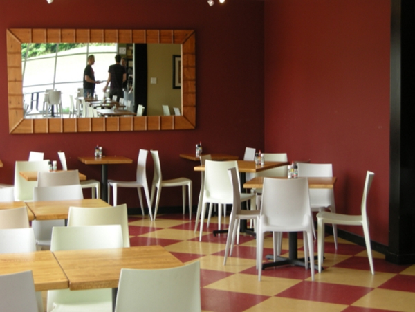
Mirrors tend to divide opinion in restaurants, and I am someone who is personally against them. Business owners tend to install them to create an illusion of space, but I am not really the sort of person who wishes to observe themselves eating! A modern design trend seems to be to angle them slightly downwards, and this creates the bizarre situation where I am enjoying a meal and fretting about my receding hairline – this is usually out of sight and out of mind!


