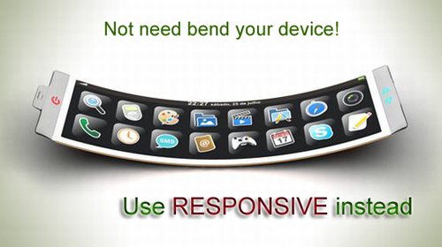
With the growing affordability and accessibility of smart phones – it’s no wonder that a growing number of us are now choosing to access websites on our mobile devices. With new tablets reaching the market every month – and with smart devices becoming cheaper by the second (just take a look at the successful tablets Google and Sony released to compete with Apple) the truth is we need to start embracing this. Mobile browsing is more popular than ever and as web designers we need to start recognizing this and channeling it into our own creations.
A website now need to be flexible and accessible no matter what size screen or device you’re working from. Which means, you need to ensure your website looks just as good on an iPhone as it does on an iPad, or even one of their huge stand alone monitors. It’s a case of adapting to survive. If your client gets equal traffic from mobile and from desktop – you need to look at how this is going to effect (and perhaps limit) the design choices you can make. After all, if half your clients audience can’t access the website when they want to – you’ve essentially failed at your job.

Of course, this doesn’t mean a complete step away from traditional desktop design. What it does mean however – is finding ways of designing that works for both types of viewing. And this is where responsive design comes in.
[ad name=”bnr-middle-post”]What is responsive design?
Well as you’re already reading this blog post, it’s likely you know anyway. But there’s no harm in a re-cap, so here goes.
Responsive design essentially allows you to get the best of both worlds, when designing for clients who need to integrate a mobile browsing strategy in with a desktop browsing one too. Responsive design is the ultimate in flexible web design – it allows you to create one website – which then adapts itself to whatever size device your audience is using. The not only saves you the hassle of designing multiple sites (one for mobile, one for desktop, one for tablets…. Etc.) but it takes the hassle away for your client too – as they won’t need to approve multiple designs.
The idea is that by using a flexible grid when designing, means that media queries are then used to regulate and determine the unique size and shape of device – from each individual visitor. Sounds simple right? Well, as life changing as this development is – it still throws up a few problems. Which I’ll now discuss.
1. Media Queries
As with anything, when responsive design works it is fantastic. And if you’re lucky you won’t run into any hassle or issues along the way. But in actual fact, media queries tend to throw up a lot of unexpected drama when working with responsive design. Responsive websites rely on these media queries to ensure they’ve accurately recognised the size of the tablet or device the viewer is using and without these responsive design can flop. You see, unfortunately, media queries don’t actually appear as default in all browsers – which can be hugely frustrating if half your audience just happens to be using an out-dated web-browser. Older browsers such as Internet Explorer 8 don’t support them at all – which can be a huge stumbling block and something you’ll need to look into from the very initial stages of design.
2. Precious Time
I doubt you’d be surprised if I told you that responsive design takes much more time and attention to detail than regular traditional design. It’s newer, and we’ve still learning how to make it most effective – which unfortunately means it’s going to take bigger chunks out of your day. This isn’t so much of an issue if you’re not pushed for time – but if you are then it might pull up some issues. Make sure your client knows that responsive design a bit more time consuming and set them realistic expectations too. The is the easiest way to keep you both happy and to keep the project running smoothly.
3. Don’t just do it “because”
Many of us, when we hear of a new method of design, want to try it out just because. This isn’t the best approach for responsive design – and here’s why. Think about what the website is actually used for – and think about the different ways customer or viewers may use the desktop site and mobile sites. For many websites and brands, the two are used completely differently – in which case having two separate designs (rather than one responsive) may actually be a smarter move. Not all companies need to embrace responsive design – and that’s nothing be ashamed of. Be smart about it and ensure the client you’re working with will actually benefit from this move towards responsive – because if not, it may not do them any good at all.
4. Something will always muck it up
It doesn’t matter how good you are, the sheer variety of tablets and device and phones out there – means that there will no doubt be some your website isn’t recognized on. Don’t let this put you off though – sure is can be disheartening when you realize some obscure tablet doesn’t support or recognize your design – but this is always going to be the case. The digital and technology industries are moving so fast it can be hard to keep up. A great way to combat this, and make yourself feel better, if to do a survey and find out what devices the majority of viewers are using. That way – you can ensure these are taken care of.


